Average Income in America: What salary in the United States puts you in the top 50%, top 10%, and top 1%? (Updated for 2023)

You’ve probably heard of “the 1%.” They’re the absurdly wealthy who have more wealth than the remaining 99% (based on data from Credit Suisse).
But what does it take to be in the 10%? 20%?
Is it still stunningly wealthy? Or does the line drop quickly?
We know that the average net worth of Americans is lower than you’d guess, but what about income? Is it the same?
So many questions!
Fortunately for us, we have two reputable data sources for this type of information:
- The Social Security Administration. Everyone who earns a paycheck will make payments to Social Security and Medicare, so they have that information as wage statistics. (last refreshed with 2022 data, which is the most recent dataset released in late October)
- The U.S. Census Bureau collects this information too. The latest is based on the latest Current Population Survey (CPS) and Annual Social and Economic Supplements (ASEC).
Whereas the SSA collects actual wage data, the Census Bureau conducts surveys and estimates values. Another big difference is that the SSA collects individual wage information and the Census estimates household income, so it is not accurate to compare them with one another.
(We used U.S. Census data when looking at average net worth of Americans)
We’re going to look at the Social Security Administration data first (since it’s based on actual data) and then the U.S. Census Bureau’s estimates (since it’s based on surveys).
📔 Quick Summary: According to the most recent Social Security data (2022), the median income was estimated to be $40,847.18, an 8.67% increase over 2021 ($37,586.03). The average income was $61,220.07.
According to the most recent Census data (2022), median household income was $74,580 (± $968). Average household income was $106,400 (± $1,034).
Social Security data isn’t updated until mid-October of the following year so 2023 data won’t be available until mid-October 2024.
Table of Contents
🔃 UPDATED: This post was most recently updated to include the release of wage statistics for 2022 by the Social Security Administration, which was released in October of 2023. This is the most recent data from the SSA for wages. We have also updated the Census Bureau data with the latest 2022 data.
Average Wage Index (SSA)
First, a definition – the national average wage index is calculated using compensation that’s subject to Federal income taxes as reported on W-2 Forms. This includes wages, tips, etc.
It doesn’t capture a household’s entire income throughout the year. This is strictly a measure of how much they earn from day jobs.
For example, dividends and capital gains aren’t included because they’re not wages. There’s also a little complexity involved with deferred compensation plans but for the purposes of our discussion, this level of specificity isn’t necessary.
🤔 Quick clarification on SSA numbers – they produce two “average wage” numbers. The first number is the average wage number calculated directly from their data.
The second number is a calculation that takes last year’s average and multiplies it with the annual percentage change in average wages, which they calculated from their tabulated wage data. I don’t know why they do this but it results in two different numbers.
According to the SSA, the average wage in 2022 was $61,220.07. (calculated from actual data)
The median wage in 2022 was $40,847.18.
(The second average, calculated by multiplying last year’s average by the annual change in wages, is $63,795.13)
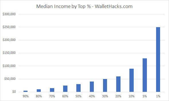
For fun, the figures below concerning percentages are taken from the data SSA provides but are themselves not averages (or medians). So the average of the Top 1% is not $250,000 a year – it’s how much you need to earn to be within the top 1% of wage earners.
Top 1%: $350,000+
How many households are in the top 1%? Over 480,002 earners are in the top 1%.
This may surprise you but to be in the top 1% of wage earners in the United States in 2022, you need to earn over $350,000 a year. You have to be in the $350,000 – $399,999.99 grouping and, likely, near the higher end.
That’s quite a tidy sum to earn in a year, that’s for sure, but I bet you thought 1% would require a much higher number.
Top 10%: $120,000-$350,000
How many households are in the top 10%? Over 1,389,426 earners are in the top 10%.
To be in the top 10% of earners, you had to earn more than $120,000.00 a year. That seems like a modest sum to be in the top decile of earners in the United States but fewer than 1.4 million earners reach that.
Top Half: $35,000
How many households are in the top 50%? Less than 9,502,181 earners are in the top 50%.
Here’s another number that may surprise you – to be in the top half (50%) of all earners you need to earn somewhere between $35,000 – $39,999.99 a year (again, towards the higher end of that range). The number of people earning less than $30,000 accounts for 38% of the population.
For reference, the 2023 Poverty Guidelines for a family of four is $30,000 ($43,930 in Alaska and $40,410in Hawaii).
Mull that one over for a minute…
Deciles (and more)
The deciles won’t be too clean-cut because the table is set up as salary ranges, but you can read this table as “how much do I need to earn to be considered top X% of salary earners.”
(A range means the decile falls somewhere in that range)
- 1%: $350,000
- 5%: $165,000
- 10%: $100,000
- 20%: $115,000
- 30%: $55,000
- 40%: $45,000
- 50%: $35,000
- 60%: $25,000
- 70%: $15,000
- 80%: $5,000
- 90%: $0.01 — $4,999
How many people make more than $X?
You may be curious to know how many people make more than $X, we have the data:
- How many people make more than $100,000 (six figures) a year? 2,186,317.
- How many people make more than $250,000 a year? 1,222,641.
- How many people make more than $500,000 a year? 704,054.
- How many people make more than $1,000,000 a year? 118,974.
- How many people make more than $2,000,000 a year? 20,407.
- How many people make more than $5,000,000 a year? 11,182.
- How many people make more than $10,000,000 a year? 3,712.
- How many people make more than $20,000,000 a year? 1,296.
- How many people make more than $50,000,000 a year? 227.
The Wealthy Are Absurdly Wealthy
These two (and a half) facts will boggle the mind:
- In 2022, there were 227 households (out of 172,030,932) with wages over $50 million.
- This is a sizable drop from 2021 when there were 506 households.
- In the 2019 data, there were 222 households that made over $50 million. In 2020, it was 358.
- In 2021, there were 117,713 households with wages over $1 million. 118,974 households hit that number in 2022 – so very similar.
Those are just wages. If someone made over $50,000,000 in a year, how much you want to be they have other sources of revenue (dividend, capital gains, etc.)?
They pull in WAY more than $50 million!
Another little “oddity:” (which holds true now, but this is 2015 data in the chart)
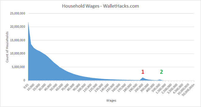
On the X axis you have the ranges of wages and on the Y axis you have the count of households. You’d expect the chart to just slope downwards, as there are fewer and fewer households included in higher incomes.
But there are two hitches, indicated with the red 1 and green 2. Red 1 is the $200,000 – $250,000 range and Green 2 is $500,000 — $999,999.
At first, I was trying to understand why this might exist. Could there be tax implications? Perhaps there is some rule somewhere else that had folks trying to pull their income down?
No – the rows of the table aren’t equal. Those two ranges are just wider!
Up until the Red 1 range, the rows had a range of $5,000. With Red 1, the range jumped to $50,000. The same is true for Green 2, the range jumped to $500,000. There are more hitches but they’re not visible in the chart, but it’s the same reason. Weird they structured it that way but that explains the weirdness in the chart.
For a second, I thought maybe something fun was happening like people shifting around their income to avoid tax law changes at different tiers… but sadly no. Just weird
The data is from 2022 and it’s organized slightly differently than the data from the Social Security Administration. Since the SSA has real data and the Census surveys a few households (~131,400), the Census uses more ranges and tries to reach statistically significant results (since it’s based on a sample).
You cannot compare the two datasets. I presented the SSA data first since it’s real data (somewhat incomplete) but the Census information is useful too.
The median household income was $74,580 (± $968), a 2.3% decline from 2021.
The mean income was $106,400 (± $1,034).
| Age of Householder | Median Income |
|---|---|
| Under 65: | $85,860 |
| 15 – 24 | $52,460 |
| 25 – 34: | $80,240 |
| 35 – 44: | $96,630 |
| 45 – 54: | $101,500 |
| 55 – 64: | $81,240 |
| 65+: | $50,290 |
Income Distribution
| Income Range | Percent Distribution |
|---|---|
| Under $15,000 | 8.3% |
| $15,000 – $24,999 | 7.4% |
| $25,000 – $34,999 | 7.6% |
| $35,000 – $49,999 | 10.6% |
| $50,000 – $74,999 | 16.2% |
| $75,000 – $99,999 | 12.3% |
| $100,000 – $149,999 | 16.4% |
| $150,000 – $199,999 | 9.2% |
| $200,000+ | 11.9% |
When you couple this data with the average net worth data, it can be very sobering.
Average Income by Education
With student loan debt topping $1.7 trillion (HOLY CRAP) as of October 2023, you might be wondering if there’s a relationship between average income and education.
There is:
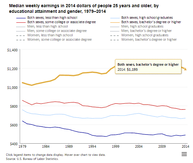
The sexes are combined and separated into four categories – less than high school, high school graduates, some college/associate degree, and bachelor’s degree or higher. These are 2014 dollars:
- Less than high school – $488/week ($25,376/yr)
- High school graduates – $668/week ($35,776/yr)
- Some college/associate degree – $761/week ($39,572/yr)
- Bachelor’s degree or higher – $1,193/week ($62,036/yr)
What you study matters, but overall the more education you have the better off you’re likely to be. There is a huge difference between those who start college and those who finish.
Also, this doesn’t capture where they are opportunities in the workplace because of uneven supply and demand for work. For example, here are 14 jobs that make over $70,000 and don’t require a college degree. The data comes from the BLS and include jobs that are in high demand, require some on-the-job training, but do not require college.
One prime example is something you’ve probably used many times before – an elevator. Elevator installers and repairers have a median income of $79,480. You will likely need to go to technical school or get an apprenticeship to learn the trade, college is not necessary.
Lastly, income doesn’t tell the whole picture (for example, it’s hard to know what is wage income and what comes from income producing investments and assets) but these numbers do open your eyes.
$30,000 a year is how much per hour?
If you are making $30,000 a year as your salary and working a 40-hour week all 52 weeks of the year, you’re making approximately $14.42 per hour.
If you have a two week vacation, your hourly rate goes up to $15.00.
$45,000 a year is how much per hour?
If you are making $45,000 a year as your salary and working a 40-hour week all 52 weeks of the year, you’re making approximately $19.23 per hour.
If you have a two week vacation, your hourly rate goes up to $20.00.
$45,000 a year is how much per hour?
If you are making $45,000 a year as your salary and working a 40-hour week all 52 weeks of the year, you’re making approximately $21.63 per hour.
If you have a two week vacation, your hourly rate goes up to $22.50.
$70,000 a year is how much per hour?
If you are making $70,000 a year as your salary and working a 40-hour week all 52 weeks of the year, you’re making approximately $33.65 per hour.
If you have a two week vacation, your hourly rate goes up to $35.00.
$100,000 a year is how much per hour?
If you are making $100,000 a year as your salary and working a 40-hour week all 52 weeks of the year, you’re making approximately $48.07 per hour.
If you have a two week vacation, your hourly rate goes up to $50.00.
$1,000,000 a year is how much per hour?
If you are making $100,000 a year as your salary and working a 40-hour week all 52 weeks of the year, you’re making approximately $480.76 per hour.
If you have a two week vacation, your hourly rate goes up to $500.00.
What are your biggest takeaways from this data?
Other Posts You May Enjoy:
How to Make Money with AI
Many people worry that AI is going to take their job. After all, the technology is already capable of performing thousands of different tasks more quickly and efficiently than any human. But can AI actually help you make money? Learn more.
Service Credit Union Bonus: $200 & $500 Checking Account
Service Credit Union has a $200 and $500 bonus offer on their Everyday Checking account. This is a direct deposit related bonus but one that offers a nice payout for a reasonable amount.
12 Best Online Typing Jobs and Where to Find Work
Do you enjoy computer work and have an ability to type quickly? If so, our list of the best online typing jobs may interest you. From data entry to transcription to freelance writing to blogging, we show you where to find work and how much you can earn. Learn more.
35 Weekend Side Hustles to Pad Your Bank Account
A good side hustle can be the key to paying off debt, increasing your savings, and pursuing your financial goals. But finding a side hustle that you can do in your downtime is easier said than done. Here are 35 weekend side hustles that are easy to start and can help you pad your bank account. Learn more.

About Jim Wang
Jim Wang is a forty-something father of four who is a frequent contributor to Forbes and Vanguard’s Blog. He has also been fortunate to have appeared in the New York Times, Baltimore Sun, Entrepreneur, and Marketplace Money.
Jim has a B.S. in Computer Science and Economics from Carnegie Mellon University, an M.S. in Information Technology – Software Engineering from Carnegie Mellon University, as well as a Masters in Business Administration from Johns Hopkins University. His approach to personal finance is that of an engineer, breaking down complex subjects into bite-sized easily understood concepts that you can use in your daily life.
One of his favorite tools (here’s my treasure chest of tools,, everything I use) is Personal Capital, which enables him to manage his finances in just 15-minutes each month. They also offer financial planning, such as a Retirement Planning Tool that can tell you if you’re on track to retire when you want. It’s free.
He is also diversifying his investment portfolio by adding a little bit of real estate. But not rental homes, because he doesn’t want a second job, it’s diversified small investments in a few commercial properties and farms in Illinois, Louisiana, and California through AcreTrader.
Recently, he’s invested in a few pieces of art on Masterworks too.
Opinions expressed here are the author’s alone, not those of any bank or financial institution. This content has not been reviewed, approved or otherwise endorsed by any of these entities.